Previous: Initial Watch Designs
As a student at Birmingham School of Jewellery, we all visited the horology department at the British Museum in November 2011 and also stopped at the Worshipful Company of Clockmakers’ Museum.
I saw a watch which I immediately like the look of. It looked incredibly clean and simple. I took this photo of it, which I later was told I shouldn’t have done, so don’t tell anyone.
It’s a centre seconds with a subsidiary hour and minute hand. This was fashionable when seconds hands were first introduced.

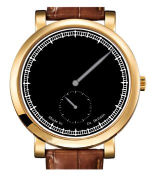
So I designed a dial which kept to these same basic principles. I didn’t like the Roman numerals on the original as I thought it looked a little clumsy, so I replaced them with simple markers. I also added in a date, as I thought that this was the most useful of the complications.

In our workshop in Birmingham, there was a regulator clock on the wall. I really liked the look of it. It looked very scientific, clean and precise. So I wondered what the dial would look like if it was set out like a regulator.
For the watch to have a sub hour hand, I thought that it would be quite complicated. We hadn’t learnt much by this stage about motion work, and so I wasn’t sure how that could be achieved.
What I did know though, was that the centre wheel drove the minutes, and through the motion work, the hour hand too. I also knew that on the Eta 6498 movement, the 4th wheel drove the seconds hand directly.
So I thought about changing the movement around so that the centre wheel was in the same place as the 4th wheel, and therefore I could have my subsidiary hour and minute hands where the subsidiary seconds hand usually is. But when I moved the train around, I found that it was going toget a bit cramped in the middle.
The solution was to put the balance wheel in the middle of the movement, and break the barrel into 3 parts. We had just done the calculations in class about how to work out the strength of the spring, and so I worked out how big 3 springs would need to be to hold to same power as the original one.

The end result looks quite decent I think. It invokes an image of an eye, although someone did mentioned that it reminded them of a Pokemon ball.
Below is the original movement, with the changes beneath it. You can see on the front that I’ve added into some motion work to get the seconds hand into the centre I then made a few dial designs. By this stage I thought that my whole subsidiary hour and minutes might be a bit too ambitious. Instead I thought that I could just do a subsidiary hour and keep the centre minute hand.
I also started off with putting the crown at the top, like a pocket watch. This is the configuration of the Eta 6497 movement.

In January 2012 we went to visit “Big Ben”, and so I changed the markers to look more like the same gothic design. I also realised that a crown at 12 o clock was not very convenient, and so moved it back to 3 o clock.

Next: Designing My First Watch


